Part 1 - Introduction to Biomedical Networks#
Structuring Biomedical Data Using Networks workshop - Network Generation#
Table of Contents#
Part 1.
Biomedical Networks
1.1. Libraries
1.2. TCGA-LUAD project
1.3. Metadata Analysis
1.4. Expression Data
Data Filtering and Preprocessing
2.1. Analysing Gene Expression Levels
2.2. Thresholding Based on Gene Expression Variance
2.3. Gene Retention at Different Variance Levels
Gene Symbol Conversion
3.1. Checking for Missing Data and Outliers
3.2. Addressing Data Heterogeneity
Correlation Matrix Calculation
Graph Construction from Correlation Matrices
Network Cleaning
Sparsification Methods for Networks
Describing Highly Connected Nodes
Storing and Managing Generated Networks
Part 2.
Patient Similarity Network Construction
DNA Methylation Network Analysis
1. Biomedical Networks#
1.1 Libraries#
# standard libraries
import os
import pickle

# scientific and data manipulation libraries
import numpy as np
import pandas as pd
from scipy import stats
from sklearn.feature_selection import mutual_info_regression
from astropy.stats import median_absolute_deviation
import mygene
import astropy

# graph and network libraries
import networkx as nx

# visualization libraries
import matplotlib.pyplot as plt
import seaborn as sns
import plotly.graph_objects as go
import plotly.io as pio
from IPython.display import Image
from IPython.display import display

import warnings
warnings.filterwarnings('ignore')
1.2 TCGA-LUAD Project#
Title: The Cancer Genome Atlas Lung Adenocarcinoma (TCGA-LUAD)
Main Focus: Study of lung adenocarcinoma (a common type of lung cancer)
Data Collected: Comprehensive genomic, epigenomic, transcriptomic, and proteomic data from lung adenocarcinoma samples
Disease Types:
Acinar Cell Neoplasms
Adenomas and Adenocarcinomas
Cystic, Mucinous, and Serous Neoplasms
Number of Cases: 585 (498 with transcriptomic data)
Data Accessibility: Available on the NIH-GDC Data Portal
Link: TCGA-LUAD Project Page
Our main focus in this notebook is on RNA-Seq based, already preprocessed gene expression data.
# main data directory for the project

raw_data_dir = '/data/raw'
intermediate_data_dir = '/data/intermediate'
# load the data from the pickle file
with open(os.path.join(raw_data_dir,"ISMB_TCGA_GE.pkl"), 'rb') as file:
    data = pickle.load(file)
Obviously this is not yet a graph dataset, so our first course of action is to decide how are we going to analyse this dataset.
There are several ways we could do that, however today we are focusing on the network biology aspect of cancer genome data.
In order to construct a biological network, we are going to first:
examine the TCGA metadata
come up with useful strategies to tackle the large data size
create the basis of a biological network
1.3 Metadata Analysis#
# let's familiarize ourselves with the data
print(data.keys())
dict_keys(['datExpr', 'datMeta'])
# let's look at the first few rows of the metadata
data["datMeta"]
| patient | race | gender | sample_type | cigarettes_per_day | Smoked | sizeFactor | replaceable | |
|---|---|---|---|---|---|---|---|---|
| _row | ||||||||
| TCGA-38-7271 | TCGA-38-7271 | white | female | Primary Tumor | 1.3699 | Smoker | 0.5841 | True |
| TCGA-55-7914 | TCGA-55-7914 | white | female | Primary Tumor | 0.274 | Smoker | 0.9873 | True |
| TCGA-95-7043 | TCGA-95-7043 | white | female | Primary Tumor | 2.1918 | Smoker | 0.5439 | True |
| TCGA-73-4658 | TCGA-73-4658 | white | female | Primary Tumor | 1.3699 | Smoker | 0.7715 | True |
| TCGA-86-8076 | TCGA-86-8076 | white | male | Primary Tumor | 0 | Never | 1.313 | True |
| ... | ... | ... | ... | ... | ... | ... | ... | ... |
| TCGA-86-8073 | TCGA-86-8073 | white | male | Primary Tumor | 2.1918 | Smoker | 1.9733 | True |
| TCGA-MN-A4N4 | TCGA-MN-A4N4 | white | male | Primary Tumor | 0 | Never | 1.0464 | True |
| TCGA-53-7626 | TCGA-53-7626 | white | female | Primary Tumor | 1.9178 | Smoker | 1.7208 | True |
| TCGA-44-A47G | TCGA-44-A47G | white | female | Primary Tumor | 1.5342 | Smoker | 0.8926 | True |
| TCGA-55-6969 | TCGA-55-6969 | white | male | Primary Tumor | 0 | Never | 1.4732 | True |
498 rows × 8 columns
# Count the number of unique patient identifiers in the 'patient' column of the dataFrame
data["datMeta"]["patient"].unique().size
498
# Count the occurrences of each unique value in the 'sample_type' column of the 'datMeta' DataFrame
data["datMeta"]['sample_type'].value_counts()
sample_type
Primary Tumor          469
Solid Tissue Normal     29
Name: count, dtype: int64
We are going to visualise various metadata attributes such as race, gender, sample type, cigarettes per day, and smoking status by gender.
# Set up the figure and axes for a 2-column layout
fig, axes = plt.subplots(3, 2, figsize=(18, 18))
fig.suptitle('Metadata Distributions', fontsize=20, y=0)

# Plot 1: Distribution of Race
sns.countplot(ax=axes[0, 0], x='race', data=data['datMeta'], palette='viridis')
axes[0, 0].set_title('Distribution of Race')
axes[0, 0].set_xlabel('Race')
axes[0, 0].set_ylabel('Count')
axes[0, 0].tick_params(axis='x', rotation=45)

# Plot 2: Gender Distribution
sns.countplot(ax=axes[0, 1], x='gender', data=data['datMeta'], palette='magma')
axes[0, 1].set_title('Gender Distribution')
axes[0, 1].set_xlabel('Gender')
axes[0, 1].set_ylabel('Count')

# Plot 3: Sample Type Distribution
sns.countplot(ax=axes[1, 0], x='sample_type', data=data['datMeta'], palette='plasma')
axes[1, 0].set_title('Sample Type Distribution')
axes[1, 0].set_xlabel('Sample Type')
axes[1, 0].set_ylabel('Count')
axes[1, 0].tick_params(axis='x', rotation=45)

# Plot 4: Distribution of Cigarettes Per Day
sns.histplot(ax=axes[1, 1], data=data['datMeta']['cigarettes_per_day'], kde=True, color='blue')
axes[1, 1].set_title('Distribution of Cigarettes Per Day')
axes[1, 1].set_xlabel('Cigarettes Per Day')
axes[1, 1].set_ylabel('Frequency')

# Plot 5: Smoking Status by Gender
sns.countplot(ax=axes[2, 0], x='Smoked', hue='gender', data=data['datMeta'], palette='coolwarm')
axes[2, 0].set_title('Smoking Status by Gender')
axes[2, 0].set_xlabel('Smoking Status')
axes[2, 0].set_ylabel('Count')
axes[2, 0].legend(title='Gender')

axes[2, 1].axis('off')
plt.tight_layout()
plt.show()
1.4 Expression Data#
This dataset contains gene expression levels for various samples, identified by their TCGA (The Cancer Genome Atlas) codes.
Each row represents a different sample, while each column represents a different gene, identified by its Ensembl gene ID.
The values in the table are the expression levels of the genes for each sample.
# let's create a new variable for the expression data alone, just for ease of use, and then inspect it
expression_data = data["datExpr"]
expression_data
| _row | ENSG00000000003.15 | ENSG00000000419.13 | ENSG00000000457.14 | ENSG00000000460.17 | ENSG00000000938.13 | ENSG00000000971.16 | ENSG00000001036.14 | ENSG00000001084.13 | ENSG00000001167.14 | ENSG00000001460.18 | ... | ENSG00000288586.1 | ENSG00000288596.2 | ENSG00000288598.1 | ENSG00000288611.1 | ENSG00000288612.1 | ENSG00000288638.1 | ENSG00000288658.1 | ENSG00000288663.1 | ENSG00000288670.1 | ENSG00000288675.1 |
|---|---|---|---|---|---|---|---|---|---|---|---|---|---|---|---|---|---|---|---|---|---|
| TCGA-38-7271 | 11.3668 | 10.3673 | 9.7884 | 8.2552 | 10.6173 | 12.8447 | 10.8836 | 10.4437 | 10.8112 | 9.1178 | ... | 4.4411 | 5.6909 | 3.8172 | 5.5378 | 4.5573 | 5.4255 | 5.1694 | 4.0073 | 7.97 | 4.664 |
| TCGA-55-7914 | 11.5434 | 10.5282 | 9.7292 | 7.9951 | 8.4858 | 10.4696 | 10.4737 | 7.9065 | 11.8983 | 8.5842 | ... | 4.768 | 8.0948 | 4.2182 | 3.5233 | 4.975 | 2.4821 | 6.0753 | 4.975 | 8.8543 | 4.3015 |
| TCGA-95-7043 | 11.411 | 11.2018 | 9.4449 | 8.3546 | 7.3211 | 10.7856 | 11.6185 | 14.1836 | 10.8329 | 8.8155 | ... | 4.2248 | 7.3539 | 5.0121 | 4.2248 | 4.8311 | 4.7304 | 5.5053 | 4.9246 | 7.6064 | 3.8623 |
| TCGA-73-4658 | 12.2149 | 10.3249 | 9.234 | 7.7537 | 11.0656 | 12.3631 | 10.9023 | 10.06 | 11.2092 | 9.0663 | ... | 4.2146 | 6.0253 | 3.8231 | 4.0984 | 4.6727 | 7.1082 | 7.1615 | 3.6533 | 7.3223 | 5.2312 |
| TCGA-86-8076 | 11.2882 | 10.2095 | 9.8186 | 7.9844 | 10.5213 | 13.7848 | 11.2318 | 10.8315 | 10.5784 | 9.6428 | ... | 4.7844 | 6.8675 | 4.5078 | 2.4821 | 5.1468 | 3.3897 | 4.2833 | 4.4553 | 8.1011 | 4.8254 |
| ... | ... | ... | ... | ... | ... | ... | ... | ... | ... | ... | ... | ... | ... | ... | ... | ... | ... | ... | ... | ... | ... |
| TCGA-86-8073 | 10.7676 | 10.5503 | 9.0277 | 8.2811 | 9.9471 | 11.8641 | 11.237 | 14.2843 | 10.9497 | 8.8266 | ... | 4.2611 | 7.157 | 4.2187 | 5.2566 | 5.276 | 2.4821 | 6.695 | 5.1967 | 7.8098 | 4.3418 |
| TCGA-MN-A4N4 | 11.656 | 11.0739 | 9.5578 | 8.7883 | 8.9532 | 11.0791 | 10.5202 | 11.331 | 11.3659 | 8.8701 | ... | 4.3317 | 7.6037 | 5.0518 | 7.4063 | 6.5835 | 3.0746 | 5.9828 | 4.9634 | 7.9208 | 5.1745 |
| TCGA-53-7626 | 10.8912 | 10.1742 | 9.6307 | 8.0179 | 10.6328 | 11.247 | 10.4815 | 9.8428 | 10.5795 | 9.86 | ... | 5.6458 | 6.6984 | 4.646 | 3.1345 | 4.8113 | 3.8962 | 5.9768 | 4.2816 | 8.4192 | 4.4566 |
| TCGA-44-A47G | 11.32 | 9.9137 | 9.3312 | 7.8703 | 11.3029 | 12.8687 | 11.2659 | 12.4677 | 10.9404 | 9.4188 | ... | 4.6125 | 8.0939 | 5.1263 | 2.4821 | 5.2619 | 5.0279 | 8.793 | 5.173 | 7.951 | 4.465 |
| TCGA-55-6969 | 10.5764 | 10.9022 | 9.3425 | 8.8147 | 9.6115 | 12.3155 | 11.216 | 11.1273 | 10.311 | 9.123 | ... | 5.9603 | 7.2623 | 4.5931 | 4.1326 | 4.5495 | 3.1863 | 3.9293 | 4.828 | 7.5868 | 4.1326 |
498 rows × 22637 columns
498 rows × 22637 columns is a quite large matrix, thus we have to consider reducing the dimensionality.
2. Data Filtering and Preprocessing#
Ideas?
Filter by Mean Expression: Select genes with high mean expression levels
Filter by Variance: Select genes with high variance across samples, as low variance genes might not contribute significantly to the analysis.
We are doing this to make sure our computations are
computationally efficient,
the network complexity is manageable,
the biological signal is enhanced thus we make sure our analysis is biologically relevant.
# A few preliminary steps that might be useful for data cleaning and preprocessing
# Ensure all columns are numeric
expression_data = expression_data.apply(pd.to_numeric, errors='coerce')

# Drop columns that could not be converted to numeric (if any)
expression_data = expression_data.dropna(axis=1, how='all')
# In case we want to check the shape of the data further down the line
expression_data.shape
(498, 22637)
# Checking for duplicate rows and columns
print(f"Number of duplicate indices: {expression_data.index.duplicated().sum()}")
print(f"Number of duplicate columns: {expression_data.columns.duplicated().sum()}")
Number of duplicate indices: 0
Number of duplicate columns: 0
2.1 Analysing Gene Expression Levels#
# Plot the distribution of gene expression levels

# Calculate the mean expression level for each gene
gene_means = expression_data.mean(axis=0)

# Plot the distribution of gene expression levels
plt.figure(figsize=(10, 6))
sns.histplot(gene_means, bins=50, kde=True)
plt.xlabel('Mean Gene Expression')
plt.ylabel('Frequency')
plt.title('Distribution of Gene Expression Levels')

# mean of the gene means
threshold = gene_means.mean()
plt.axvline(threshold, color='red', linestyle='--', label=f'Mean = {threshold:.2f}')
plt.legend()

plt.show()
The histogram shows the frequency of genes at different mean expression levels.
Dashed red line shows the mean of the mean gene expression. (8.11)
The histogram show a bimodal distribution - does this mean two groups of genes?
Some genes are consistently expressed at lower levels (housekeeping genes?), while others are expressed at higher levels.
We could use this for thresholding, however it is not informative about the variability of the genes.
Still, let’s inspect how many genes would retain in our dataset at different expression thresholds.
# Filter out low-expressed genes from the dataset

def filter_low_expression_genes(data, threshold=1.0):
    """
    Filter out low-expressed genes from the dataset.

    Calculates the mean expression level for each gene and filters out
    genes whose mean expression level is below the specified threshold.

    Parameters:
    data (DataFrame): Expression data with genes as columns.
    threshold (float): Minimum mean expression level to retain a gene.
                       Default is 1.0.

    Returns:
    DataFrame: Filtered data with genes above the threshold.
    """
    # Calculate the mean expression for each gene
    gene_means = data.mean(axis=0)
    # Filter out genes with mean expression below the threshold
    mask = gene_means >= threshold
    filtered_data = data.loc[:, mask]
    return filtered_data
# Gene Retention at Various Thresholds
# Define a range of thresholds
thresholds = np.arange(0, 15, 0.5)

# List to store the number of genes retained at each threshold
num_genes = []

# Assuming df_renamed is your DataFrame with gene expression data
for threshold in thresholds:
    df_filtered = filter_low_expression_genes(expression_data, threshold)
    num_genes.append(df_filtered.shape[1])

# Plot the results
plt.figure(figsize=(10, 6))
plt.plot(thresholds, num_genes, marker='o')
plt.xlabel('Threshold')
plt.ylabel('Number of Genes Retained')
plt.title('Number of Genes Retained at Different Thresholds')
plt.grid(True)
plt.show()
2.2 Thresholding Based on Gene Expression Variance#
High-dimensional data can be computationally expensive to process.
Genes with higher variance across samples are likely to be more biologically relevant.
Low-variance genes often represent housekeeping genes or noise.
'''
#################################################
                YOUR CODE HERE
#################################################
Variance-Based Gene Filtering
Write a function similarly to `filter_low_expression_genes()`.
It takes in a dataframe and a threshold value as argument,
and call it filter_high_variance_genes()

The function should:
1. Compute the variance of expression levels for each gene across all samples.

2. Create a boolean mask to filter out genes with variance below the threshold

3. Apply the mask, and retain only those genes with variance above the threshold
'''

def filter_high_variance_genes(data, threshold):
    """
    Filter out genes with variance below the specified threshold.

    Calculates the variance for each gene and filters out genes whose
    variance is below the specified threshold.

    Parameters:
    data (DataFrame): Gene expression data with genes as columns and samples as rows.
    threshold (float): Minimum variance level to retain a gene.

    Returns:
    DataFrame: Filtered data with genes having variance above the threshold.
    """

    # Calculate the variance for each gene (column)
    gene_variances = data.var(axis=0)
    # Create a boolean mask to filter out genes with variance below the threshold
    mask = gene_variances >= threshold
    # Apply the mask to filter the DataFrame
    filtered_data = data.loc[:, mask]
    return filtered_data
2.3 Gene Retention at Different Variance Levels#
Idea:
Visualise the gene retention at different variance thresholds.
Calculate the 75th percentile of the variance distribution, and use it as a threshold.
It is a good balance between retaining enough data for meaningful analysis and removing low-variance noise.
# Define a range of variance thresholds
variance_thresholds = np.arange(0, 10, 0.5)

# List to store the number of genes retained at each threshold
num_genes = []

# Assuming df_renamed is your DataFrame with gene expression data
for threshold in variance_thresholds:
    df_filtered = filter_high_variance_genes(expression_data, threshold)
    num_genes.append(df_filtered.shape[1])

# Calculate the variance for each gene
gene_variances = expression_data.var(axis=0)
# Calculate the 75th percentile of the variance distribution
variance_threshold = np.percentile(gene_variances, 75)
print(f"Chosen Variance Threshold: {variance_threshold }")

# Plot the results
plt.figure(figsize=(10, 6))
plt.plot(variance_thresholds, num_genes, marker='o')
plt.axvline(variance_threshold, color='red', linestyle='--', label=f'75th Percentile Threshold = {variance_threshold:.2f}')
plt.xlabel('Variance')
plt.ylabel('Number of Genes Retained')
plt.legend()
plt.title('Number of Genes Retained at Different Variance Thresholds')
plt.grid(True)
plt.show()
Chosen Variance Threshold: 1.2018901296749187
Let’s assign this value as threshold to focus on genes with higher variance.
# Assign the filtered data to a new variable
# Focusing on the top quartile (75th percentile) of genes with the highest variance
df_filtered_variance = filter_high_variance_genes(expression_data, threshold = 1.2)
print(f"Filtered data shape: {df_filtered_variance.shape}")  # Check the new shape to confirm filtering
Filtered data shape: (498, 5671)
3. Gene Symbol Conversion: ENSG to HGCN#
Converting Ensembl gene IDs (ENSG) to HGNC (HUGO Gene Nomenclature Committee) gene symbols is often a good practice as HGCN is
standard identifier,
more human readable,
is widely used in publications, thus helps domain experts understand more effectively the analysis.
We are using for this conversion the mygene package. DOC
def rename_ensembl_to_gene_names(df, chunk_size=1000):
    """
    Renames Ensembl gene IDs to gene names using mygene.

    Parameters:
    df (pd.DataFrame): DataFrame with Ensembl gene IDs as columns.
    chunk_size (int): Number of Ensembl IDs to query at a time.

    Returns:
    pd.DataFrame: DataFrame with gene names as columns, excluding genes that couldn't be mapped.
    """

    # Make a copy of the DataFrame to avoid modifying the original
    df_copy = df.copy()

    # Remove the `.number` suffix from ENSG IDs
    df_copy.columns = df_copy.columns.str.split('.').str[0]

    # Initialize mygene client
    mg = mygene.MyGeneInfo()

    # Split ENSG IDs into smaller chunks
    def chunks(lst, n):
        """Yield successive n-sized chunks from lst."""
        for i in range(0, len(lst), n):
            yield lst[i:i + n]

    ensg_ids = df_copy.columns.tolist()
    gene_mappings = []

    for chunk in chunks(ensg_ids, chunk_size):
        result = mg.querymany(chunk, scopes='ensembl.gene', fields='symbol', species='human')
        gene_mappings.extend(result)

    # Create a mapping from ENSG to gene symbol, handle missing mappings
    ensg_to_gene = {item['query']: item.get('symbol', None) for item in gene_mappings}

    # Log the unmapped genes
    unmapped_genes = [gene for gene in ensg_ids if ensg_to_gene.get(gene) is None]
    if unmapped_genes:
        print(f"Unmapped genes: {unmapped_genes}")

    # Filter the DataFrame to only include columns that have been mapped
    df_filtered = df_copy.loc[:, df_copy.columns.isin(ensg_to_gene.keys())]

    # Further filter to ensure we have the same number of columns as mapped gene names
    df_filtered = df_filtered.loc[:, [ensg for ensg in df_filtered.columns if ensg_to_gene[ensg] is not None]]

    # Assign new column names
    df_filtered.columns = [ensg_to_gene[ensg] for ensg in df_filtered.columns]

    # Handle duplicate gene names by aggregating them (e.g., by taking the mean)
    df_final = df_filtered.T.groupby(df_filtered.columns).mean().T

    return df_final
# convert the ensembl gene IDs to gene names
df_renamed = rename_ensembl_to_gene_names(df_filtered_variance)
1 input query terms found no hit:	['ENSG00000168078']
1 input query terms found no hit:	['ENSG00000180525']
2 input query terms found no hit:	['ENSG00000236740', 'ENSG00000239467']
9 input query terms found no hit:	['ENSG00000256618', 'ENSG00000259820', 'ENSG00000259834', 'ENSG00000261068', 'ENSG00000261534', 'ENS
Unmapped genes: ['ENSG00000166104', 'ENSG00000168078', 'ENSG00000180525', 'ENSG00000189229', 'ENSG00000197476', 'ENSG00000203635', 'ENSG00000204584', 'ENSG00000213058', 'ENSG00000214776', 'ENSG00000214797', 'ENSG00000215146', 'ENSG00000217801', 'ENSG00000218048', 'ENSG00000218175', 'ENSG00000218274', 'ENSG00000218617', 'ENSG00000220154', 'ENSG00000222000', 'ENSG00000223829', 'ENSG00000223931', 'ENSG00000224251', 'ENSG00000224585', 'ENSG00000224945', 'ENSG00000226025', 'ENSG00000226286', 'ENSG00000226468', 'ENSG00000226668', 'ENSG00000226816', 'ENSG00000227619', 'ENSG00000227755', 'ENSG00000228113', 'ENSG00000228477', 'ENSG00000228509', 'ENSG00000228613', 'ENSG00000229312', 'ENSG00000229896', 'ENSG00000229970', 'ENSG00000230623', 'ENSG00000230628', 'ENSG00000230699', 'ENSG00000230882', 'ENSG00000231331', 'ENSG00000231533', 'ENSG00000231703', 'ENSG00000231881', 'ENSG00000231892', 'ENSG00000231990', 'ENSG00000232006', 'ENSG00000232949', 'ENSG00000234156', 'ENSG00000234648', 'ENSG00000235563', 'ENSG00000235584', 'ENSG00000235721', 'ENSG00000235939', 'ENSG00000235994', 'ENSG00000236212', 'ENSG00000236283', 'ENSG00000236449', 'ENSG00000236740', 'ENSG00000237550', 'ENSG00000237813', 'ENSG00000238279', 'ENSG00000239467', 'ENSG00000244306', 'ENSG00000247134', 'ENSG00000248347', 'ENSG00000248545', 'ENSG00000249001', 'ENSG00000249007', 'ENSG00000249199', 'ENSG00000249743', 'ENSG00000249746', 'ENSG00000250049', 'ENSG00000250509', 'ENSG00000250770', 'ENSG00000250978', 'ENSG00000251095', 'ENSG00000251532', 'ENSG00000253217', 'ENSG00000253227', 'ENSG00000253288', 'ENSG00000253339', 'ENSG00000253361', 'ENSG00000254054', 'ENSG00000254143', 'ENSG00000254290', 'ENSG00000254367', 'ENSG00000254632', 'ENSG00000254851', 'ENSG00000254988', 'ENSG00000255026', 'ENSG00000255085', 'ENSG00000255182', 'ENSG00000255310', 'ENSG00000255345', 'ENSG00000255366', 'ENSG00000255462', 'ENSG00000255847', 'ENSG00000255910', 'ENSG00000255983', 'ENSG00000256417', 'ENSG00000256443', 'ENSG00000256615', 'ENSG00000256618', 'ENSG00000256673', 'ENSG00000256969', 'ENSG00000257474', 'ENSG00000257512', 'ENSG00000257604', 'ENSG00000257826', 'ENSG00000257829', 'ENSG00000257894', 'ENSG00000258053', 'ENSG00000258077', 'ENSG00000258168', 'ENSG00000258342', 'ENSG00000258346', 'ENSG00000258661', 'ENSG00000258676', 'ENSG00000258752', 'ENSG00000258837', 'ENSG00000258844', 'ENSG00000259087', 'ENSG00000259094', 'ENSG00000259342', 'ENSG00000259345', 'ENSG00000259353', 'ENSG00000259425', 'ENSG00000259723', 'ENSG00000259820', 'ENSG00000259834', 'ENSG00000259925', 'ENSG00000260197', 'ENSG00000260289', 'ENSG00000260328', 'ENSG00000260337', 'ENSG00000260430', 'ENSG00000260597', 'ENSG00000260604', 'ENSG00000260710', 'ENSG00000260711', 'ENSG00000260877', 'ENSG00000260997', 'ENSG00000261068', 'ENSG00000261104', 'ENSG00000261123', 'ENSG00000261172', 'ENSG00000261296', 'ENSG00000261305', 'ENSG00000261502', 'ENSG00000261534', 'ENSG00000261578', 'ENSG00000261600', 'ENSG00000261762', 'ENSG00000261786', 'ENSG00000261804', 'ENSG00000262539', 'ENSG00000262580', 'ENSG00000262714', 'ENSG00000262873', 'ENSG00000262877', 'ENSG00000262920', 'ENSG00000262979', 'ENSG00000263301', 'ENSG00000263893', 'ENSG00000264112', 'ENSG00000264659', 'ENSG00000265298', 'ENSG00000265750', 'ENSG00000266302', 'ENSG00000266830', 'ENSG00000266869', 'ENSG00000266968', 'ENSG00000267072', 'ENSG00000267383', 'ENSG00000267466', 'ENSG00000267506', 'ENSG00000267640', 'ENSG00000267886', 'ENSG00000267892', 'ENSG00000268362', 'ENSG00000268416', 'ENSG00000268555', 'ENSG00000268833', 'ENSG00000268903', 'ENSG00000269028', 'ENSG00000269353', 'ENSG00000269918', 'ENSG00000269954', 'ENSG00000269981', 'ENSG00000270460', 'ENSG00000270605', 'ENSG00000270933', 'ENSG00000270977', 'ENSG00000271392', 'ENSG00000271959', 'ENSG00000272079', 'ENSG00000272141', 'ENSG00000272279', 'ENSG00000272379', 'ENSG00000272405', 'ENSG00000272502', 'ENSG00000272512', 'ENSG00000272622', 'ENSG00000272626', 'ENSG00000272720', 'ENSG00000272825', 'ENSG00000272865', 'ENSG00000273108', 'ENSG00000273151', 'ENSG00000273179', 'ENSG00000273203', 'ENSG00000273230', 'ENSG00000273295', 'ENSG00000273301', 'ENSG00000273328', 'ENSG00000273760', 'ENSG00000273906', 'ENSG00000274002', 'ENSG00000274414', 'ENSG00000274979', 'ENSG00000275678', 'ENSG00000276093', 'ENSG00000276851', 'ENSG00000276980', 'ENSG00000277287', 'ENSG00000277840', 'ENSG00000278263', 'ENSG00000278266', 'ENSG00000278484', 'ENSG00000278864', 'ENSG00000278912', 'ENSG00000278962', 'ENSG00000279017', 'ENSG00000279286', 'ENSG00000279511', 'ENSG00000279518', 'ENSG00000279662', 'ENSG00000279806', 'ENSG00000279878', 'ENSG00000279930', 'ENSG00000280002', 'ENSG00000280027', 'ENSG00000280032', 'ENSG00000280079', 'ENSG00000280138', 'ENSG00000280202', 'ENSG00000280217', 'ENSG00000280285', 'ENSG00000280334', 'ENSG00000280399', 'ENSG00000280435', 'ENSG00000283098', 'ENSG00000283142', 'ENSG00000283413', 'ENSG00000283486', 'ENSG00000283631', 'ENSG00000283633', 'ENSG00000283907', 'ENSG00000284636', 'ENSG00000284928', 'ENSG00000285108', 'ENSG00000285128', 'ENSG00000285417', 'ENSG00000285476', 'ENSG00000285517', 'ENSG00000285601', 'ENSG00000285820', 'ENSG00000285847', 'ENSG00000285933', 'ENSG00000286009', 'ENSG00000286015', 'ENSG00000286073', 'ENSG00000286133', 'ENSG00000286191', 'ENSG00000286256', 'ENSG00000286299', 'ENSG00000286342', 'ENSG00000286355', 'ENSG00000286358', 'ENSG00000286403', 'ENSG00000286449', 'ENSG00000286456', 'ENSG00000286519', 'ENSG00000286587', 'ENSG00000286722', 'ENSG00000286750', 'ENSG00000286797', 'ENSG00000286802', 'ENSG00000286818', 'ENSG00000286830', 'ENSG00000286892', 'ENSG00000286944', 'ENSG00000286989', 'ENSG00000287003', 'ENSG00000287051', 'ENSG00000287052', 'ENSG00000287055', 'ENSG00000287059', 'ENSG00000287097', 'ENSG00000287185', 'ENSG00000287238', 'ENSG00000287245', 'ENSG00000287252', 'ENSG00000287271', 'ENSG00000287338', 'ENSG00000287352', 'ENSG00000287390', 'ENSG00000287426', 'ENSG00000287430', 'ENSG00000287460', 'ENSG00000287550', 'ENSG00000287626', 'ENSG00000287627', 'ENSG00000287656', 'ENSG00000287673', 'ENSG00000287725', 'ENSG00000287770', 'ENSG00000287778', 'ENSG00000287804', 'ENSG00000287839', 'ENSG00000287860', 'ENSG00000287879', 'ENSG00000287887', 'ENSG00000287906', 'ENSG00000287920', 'ENSG00000287929', 'ENSG00000288075', 'ENSG00000288218']
# Let's check the new shape of the data after renaming
print("Shape of df_filtered_variance:", df_filtered_variance.shape)
print("Shape of df_renamed:", df_renamed.shape)
Shape of df_filtered_variance: (498, 5671)
Shape of df_renamed: (498, 5338)
What could this mean?
The output of the mygene and the different number of rows indicate that some of the genes werent mapped to a gene ID or multiple were mapped to the same gene ID.
In the first case we disregard those genes, in the second we calculate the mean expression value.
# let's inspect the first few rows of the renamed DataFrame
df_renamed
| A2M | A2ML1 | A4GALT | AACSP1 | AADAC | AADACP1 | AARD | AASS | AATBC | AATK | ... | ZNF90 | ZP3 | ZPLD1 | ZPLD2P | ZSCAN1 | ZSCAN23 | ZSCAN31 | ZSCAN4 | ZWINT | ZYG11A | |
|---|---|---|---|---|---|---|---|---|---|---|---|---|---|---|---|---|---|---|---|---|---|
| TCGA-38-7271 | 17.7492 | 4.4411 | 10.1862 | 3.5845 | 9.6415 | 3.5845 | 8.0089 | 11.2890 | 6.8710 | 8.6552 | ... | 6.1774 | 6.9127 | 4.9403 | 3.5845 | 3.8172 | 5.7385 | 9.0817 | 3.2709 | 9.2615 | 4.0073 |
| TCGA-55-7914 | 14.8513 | 4.4530 | 8.9312 | 3.6762 | 6.5685 | 3.6762 | 6.8983 | 10.5920 | 7.9894 | 8.2660 | ... | 9.9162 | 7.9426 | 2.4821 | 2.4821 | 5.0222 | 4.3796 | 10.9565 | 3.0918 | 10.1334 | 8.3219 |
| TCGA-95-7043 | 14.1691 | 4.5026 | 9.0834 | 3.8623 | 5.5634 | 8.0183 | 3.6226 | 10.5600 | 7.5223 | 8.8214 | ... | 5.3150 | 5.8224 | 3.6226 | 3.2988 | 3.8623 | 5.6728 | 10.8095 | 2.4821 | 10.9149 | 6.7593 |
| TCGA-73-4658 | 16.7238 | 3.1704 | 9.1443 | 2.4821 | 4.3206 | 3.6533 | 4.8856 | 10.5574 | 6.0253 | 7.8940 | ... | 4.6727 | 6.9805 | 5.4212 | 3.6533 | 3.4468 | 3.6533 | 8.9874 | 3.4468 | 9.7828 | 3.4468 |
| TCGA-86-8076 | 15.6783 | 4.7422 | 9.5150 | 3.2271 | 7.2321 | 5.1146 | 7.2174 | 10.3567 | 7.2467 | 10.4765 | ... | 4.8254 | 7.9800 | 3.6417 | 3.9275 | 3.6417 | 5.0478 | 9.5810 | 3.0118 | 8.6640 | 4.7844 |
| ... | ... | ... | ... | ... | ... | ... | ... | ... | ... | ... | ... | ... | ... | ... | ... | ... | ... | ... | ... | ... | ... |
| TCGA-86-8073 | 16.3773 | 4.0817 | 9.4234 | 6.6519 | 6.7641 | 4.2611 | 7.1467 | 11.3497 | 7.0724 | 8.7741 | ... | 8.6449 | 9.2445 | 5.9388 | 6.8492 | 5.8132 | 7.2074 | 10.2410 | 5.1126 | 10.1390 | 8.2478 |
| TCGA-MN-A4N4 | 14.9411 | 6.7210 | 11.9107 | 8.8283 | 3.4947 | 3.0746 | 4.1736 | 9.6396 | 6.6811 | 9.3538 | ... | 10.1845 | 7.5083 | 5.0939 | 5.7178 | 6.2061 | 6.9167 | 9.4672 | 3.3143 | 10.0583 | 8.4566 |
| TCGA-53-7626 | 16.7343 | 5.2575 | 9.5379 | 2.4821 | 5.7120 | 5.0910 | 5.6287 | 10.7802 | 9.3334 | 9.3085 | ... | 5.4842 | 7.9278 | 3.8286 | 3.7563 | 3.8286 | 6.0927 | 10.0507 | 4.2816 | 9.4627 | 7.4014 |
| TCGA-44-A47G | 15.6622 | 3.7345 | 9.8660 | 4.1045 | 6.2214 | 4.9759 | 4.2980 | 10.3975 | 7.8841 | 10.1369 | ... | 4.9218 | 7.7402 | 5.9326 | 4.7450 | 3.9944 | 5.3854 | 7.4843 | 4.4650 | 9.5817 | 4.6804 |
| TCGA-55-6969 | 14.8136 | 4.3058 | 9.7702 | 6.8425 | 5.2016 | 3.9293 | 7.1699 | 8.8889 | 6.1528 | 7.6565 | ... | 6.4289 | 7.9499 | 4.0012 | 6.4059 | 3.7694 | 3.6792 | 8.5268 | 2.4821 | 10.8228 | 8.6068 |
498 rows × 5338 columns
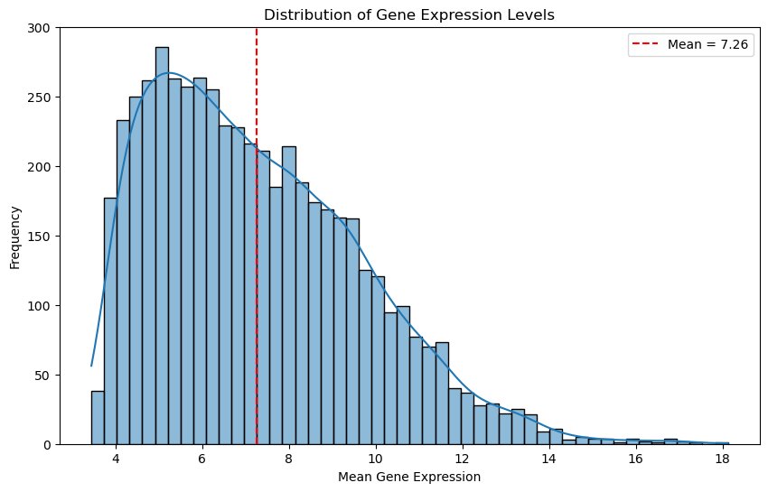
Let’s look at the distribution again, this time for the filtered data.
# Plot the distribution of gene expression levels

# Calculate the mean expression level for each gene
gene_means = df_renamed.mean(axis=0)

# Plot the distribution of gene expression levels
plt.figure(figsize=(10, 6))
sns.histplot(gene_means, bins=50, kde=True)
plt.xlabel('Mean Gene Expression')
plt.ylabel('Frequency')
plt.title('Distribution of Gene Expression Levels')

# mean of the gene means
threshold = gene_means.mean()
plt.axvline(threshold, color='red', linestyle='--', label=f'Mean = {threshold:.2f}')
plt.legend()

plt.show()
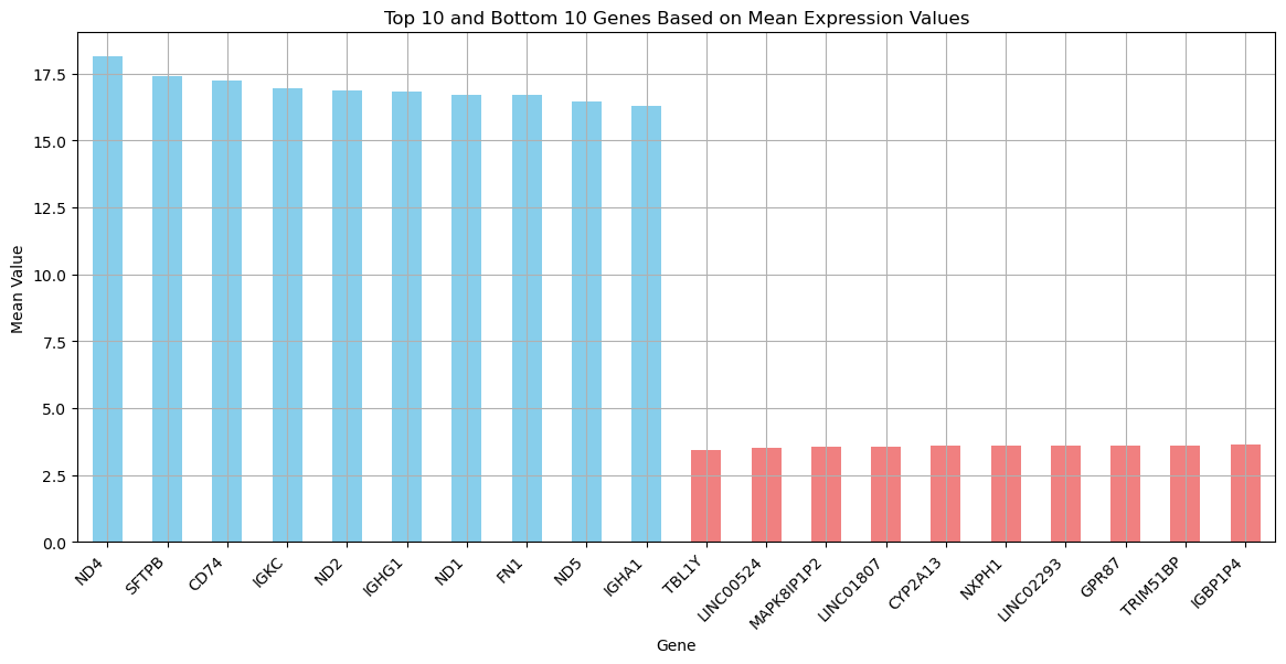
Let’s see the most extreme cases to get a better idea what is in the data.
# Sort and get the top 10 and bottom 10 columns based on their mean values

top_10_columns = gene_means.sort_values(ascending=False).head(10)
bottom_10_columns = gene_means.sort_values(ascending=True).head(10)

# Combine top 10 and bottom 10 columns into one DataFrame
combined = pd.concat([top_10_columns, bottom_10_columns])

# Plot the results
plt.figure(figsize=(14, 6))
combined.plot(kind='bar', color=['skyblue' if i < 10 else 'lightcoral' for i in range(20)])
plt.title('Top 10 and Bottom 10 Genes Based on Mean Expression Values')
plt.ylabel('Mean Value')
plt.xlabel('Gene')
plt.xticks(rotation=45, ha='right')
plt.grid(True)
plt.show()
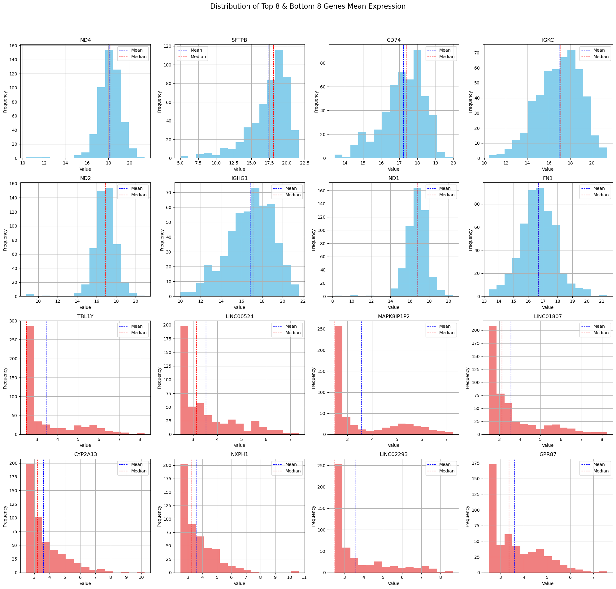
Now let’s inspect the distribution of these extreme cases.
# Select numerical columns
numerical_columns = df_renamed.select_dtypes(include=['float64', 'int64'])

# Calculate the mean of each column for the numerical columns only
means = numerical_columns.mean()

# Get the top 8 and bottom 8 columns based on mean values
top_8_columns = means.nlargest(8).index.tolist()
bottom_8_columns = means.nsmallest(8).index.tolist()

# Combine top 8 and bottom 8 columns for plotting
columns_to_plot = top_8_columns + bottom_8_columns

# Filter the numerical columns to only include those to plot
filtered_numerical_columns = numerical_columns[columns_to_plot]

# Calculate the number of rows needed for subplots based on the number of selected columns
num_plots = len(filtered_numerical_columns.columns)
num_rows = (num_plots // 4) + (num_plots % 4 > 0)  # Ensure there is an extra row if there are leftovers

# Plot histograms for each selected numerical column
fig, axes = plt.subplots(num_rows, 4, figsize=(20, 5 * num_rows))  # Adjust width and height as needed
fig.suptitle('Distribution of Top 8 & Bottom 8 Genes Mean Expression', fontsize=16)

for i, col in enumerate(filtered_numerical_columns.columns):
    ax = axes.flatten()[i]
    filtered_numerical_columns[col].hist(bins=15, ax=ax, color='skyblue' if i < 8 else 'lightcoral')
    ax.set_title(col)
    ax.set_xlabel('Value')
    ax.set_ylabel('Frequency')

    # Adding mean and median lines
    mean_val = filtered_numerical_columns[col].mean()
    median_val = filtered_numerical_columns[col].median()
    ax.axvline(mean_val, color='blue', linestyle='dashed', linewidth=1)
    ax.axvline(median_val, color='red', linestyle='dashed', linewidth=1)
    ax.legend({'Mean': mean_val, 'Median': median_val})

# Hide any unused axes if the number of plots isn't a perfect multiple of 4
if num_plots % 4:
    for ax in axes.flatten()[num_plots:]:
        ax.set_visible(False)

plt.tight_layout(rect=[0, 0.03, 1, 0.95])  # Adjust layout to make room for the suptitle
plt.show()
4. Correlation Matrix Calculation#
In order to create a biological network, we have to calculate the correlation matrix of the gene expression data.
The correlation matrix shows how strongly pairs of genes are related.
The assumption is that if genes are correlated, then this means they influence each others behaviour.
Using the correlation matrix, we can build a gene expression network. In this network, genes are connected based on significant correlations.
nodes: genes
edges: highly correlated genes (above a given threshold)
edge-weights: correlation values
There are a few correlation metrics one could consider:
-
O(n^2) complexity, fast for large datasets
-
O(n^2 log n) complexity, relatively fast but can be slower than Pearson
Absolute biweight midcorrelation
Robust but slower than Pearson and Spearman, suitable for datasets with outliers
# function to calculate absolute biweight midcorrelation
def calc_abs_bicorr(data):
    """
    Calculate the absolute biweight midcorrelation matrix for numeric data.

    Parameters:
    data (pd.DataFrame): Input DataFrame with numeric data.

    Returns:
    pd.DataFrame: DataFrame containing the absolute biweight midcorrelation matrix.
    """

    # Select only numeric data
    data = data._get_numeric_data()
    cols = data.columns
    idx = cols.copy()
    mat = data.to_numpy(dtype=float, na_value=np.nan, copy=False)
    mat = mat.T

    K = len(cols)
    correl = np.empty((K, K), dtype=np.float32)

    # Calculate biweight midcovariance
    bicorr = astropy.stats.biweight_midcovariance(mat, modify_sample_size=True)

    for i in range(K):
        for j in range(K):
            if i == j:
                correl[i, j] = 1.0
            else:
                denominator = np.sqrt(bicorr[i, i] * bicorr[j, j])
                if denominator != 0:
                    correl[i, j] = bicorr[i, j] / denominator
                else:
                    correl[i, j] = 0  # Or handle it in another appropriate way

    return pd.DataFrame(data=np.abs(correl), index=idx, columns=cols, dtype=np.float32)
! Consider loading in precomputed correlation matrices and skipping the cell below as it might take some time.
# # Dictionary to store different correlation matrices
# correlation_matrices = {}

# # Pearson correlation - O(n^2) complexity, fast for large datasets
# correlation_matrices['pearson'] = df_renamed.corr(method='pearson')

# # Spearman rank correlation -  O(n^2 log n) complexity, relatively fast but can be slower than Pearson
# correlation_matrices['spearman'] = df_renamed.corr(method='spearman')

# # Biweight midcorrelation -  Robust but slower than Pearson and Spearman, suitable for datasets with outliers
# correlation_matrices['biweight_midcorrelation'] = abs_bicorr(df_renamed)

# # Print the keys of the correlation matrices to verify
# print("Correlation matrices calculated:")
# print(correlation_matrices.keys())


# # Save the entire dictionary of correlation matrices as a pickle file
# with open(os.path.join(intermediate_data_dir,"correlation_matrices.pkl"), 'wb') as f:
#     pickle.dump(correlation_matrices, f)
# Load the entire dictionary of correlation matrices from a pickle file
with open(os.path.join(intermediate_data_dir,"correlation_matrices.pkl"), 'rb') as f:
    correlation_matrices = pickle.load(f)

# Verify the loaded data
print(correlation_matrices.keys())
dict_keys(['pearson', 'spearman', 'biweight_midcorrelation'])
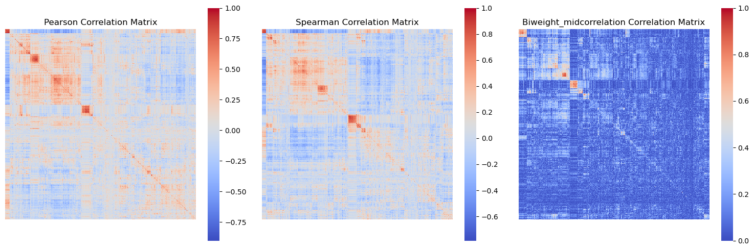
from scipy.cluster.hierarchy import linkage, leaves_list

def plot_correlation_matrices(correlation_matrices):
    fig, axes = plt.subplots(1, 3, figsize=(15, 5))  # Adjust to 1 row and 3 columns
    axes = axes.flatten()

    for i, (key, matrix) in enumerate(correlation_matrices.items()):
        # Perform hierarchical clustering
        Z = linkage(matrix, method='average')  # You can use other methods like 'single', 'complete', etc.
        idx = leaves_list(Z)

        # Reorder matrix
        ordered_matrix = matrix.iloc[idx, :].iloc[:, idx]

        # Plot heatmap
        sns.heatmap(ordered_matrix, ax=axes[i], cmap='coolwarm', cbar=True, xticklabels=False, yticklabels=False)
        axes[i].set_title(f'{key.capitalize()} Correlation Matrix')

        # Set square aspect ratio
        axes[i].set_aspect('equal', adjustable='box')

    # Hide any unused subplots
    for j in range(i + 1, len(axes)):
        axes[j].set_visible(False)

    plt.tight_layout()
    plt.show()
We are not going to run this script, because it takes a while.
# use the function to plot the correlation matrices
# plot_correlation_matrices(correlation_matrices)
# Display the image of the correlation matrices
display(Image(filename=os.path.join(intermediate_data_dir,
                                    "figures",
                                    "correlation_matrices_figure.png")))
5. Graph Construction from Correlation Matrices#
In this stage we are leaving behind the raw data, and we are going to start to work with network objects.
We are using the NetworkX library for this.
We are going to run a function create_graph_from_correlation.
The function starts by creating an empty graph G. Then iterates through the columns of the correlation matrix and adds each column name as a node in the graph. This means each gene (or feature) in your dataset becomes a node in the graph.
The function iterates over the upper triangle of the correlation matrix (excluding the diagonal) to avoid redundancy and self-loops.
For each pair of nodes (i, j), it checks if the absolute value of the correlation coefficient between them is greater than or equal to the specified threshold. If the condition is met, an edge is added between the nodes i and j with the correlation coefficient as the weight of the edge. This signifies a strong correlation (positive or negative) between the two nodes.
def create_graph_from_correlation(correlation_matrix, threshold=0.8):
    """
    Creates a graph from a correlation matrix using a specified threshold.

    Parameters:
    correlation_matrix (pd.DataFrame): DataFrame containing the correlation matrix.
    threshold (float): Threshold for including edges based on correlation value.

    Returns:
    G (nx.Graph): Graph created from the correlation matrix.
    """
    G = nx.Graph()

    # Add nodes
    for node in correlation_matrix.columns:
        G.add_node(node)

    # Add edges with weights above the threshold
    for i in range(correlation_matrix.shape[0]):
        for j in range(i + 1, correlation_matrix.shape[1]):
            if i != j:  # Ignore the diagonal elements
                weight = correlation_matrix.iloc[i, j]
                if abs(weight) >= threshold:
                    G.add_edge(correlation_matrix.index[i], correlation_matrix.columns[j], weight=weight)

    return G
Yet again, to save some time and resources, we will load the graph from a .gml file.
## Create a graph from the Pearson correlation matrix with a threshold of 0.8
# pearson_graph = create_graph_from_correlation(correlation_matrices['pearson'], threshold=0.8)
# nx.write_gml(pearson_graph, os.path.join(data_dir,'gene_coexpression_network_pearson.gml'))
pearson_graph = nx.read_gml(os.path.join(intermediate_data_dir,'gene_coexpression_network_pearson.gml'))
Now let’s go through a few useful NetworkX functions and create a print_graph_info() function.
def print_graph_info(G):
    """
    Print basic information about a NetworkX graph.


    Parameters:
    G (nx.Graph): The NetworkX graph.
    """
    print(f"Number of nodes: {G.number_of_nodes()}")
    print(f"Number of edges: {G.number_of_edges()}")
    print("Sample nodes:", list(G.nodes)[:10])  # Print first 10 nodes as a sample
    print("Sample edges:", list(G.edges(data=True))[:10])  # Print first 10 edges as a sample

    info_str = "Graph type: "
    is_directed = G.is_directed()
    if is_directed:
        info_str += "directed"
    else:
        info_str += "undirected"
    print(info_str)

    # Check for self-loops
    self_loops = list(nx.selfloop_edges(G))
    if self_loops:
        print(f"Number of self-loops: {len(self_loops)}")
        print("Self-loops:", self_loops)
    else:
        print("No self-loops in the graph.")

    # density of the graph
    density = nx.density(G)
    print(f"Graph density: {density}")

    # Find and print the number of connected components
    num_connected_components = nx.number_connected_components(G)
    print(f"Number of connected components: {num_connected_components}")

    # Calculate and print the clustering coefficient of the graph
    clustering_coeff = nx.average_clustering(G)
    print(f"Average clustering coefficient: {clustering_coeff}")
print_graph_info(pearson_graph)
Number of nodes: 5338
Number of edges: 13449
Sample nodes: ['A2M', 'A2ML1', 'A4GALT', 'AACSP1', 'AADAC', 'AADACP1', 'AARD', 'AASS', 'AATBC', 'AATK']
Sample edges: [('A2M', 'ABCA8', {'weight': 0.8308274641648915}), ('A2M', 'ADAMTS8', {'weight': 0.8036704002698273}), ('A2M', 'AOC3', {'weight': 0.8767411078325781}), ('A2M', 'C7', {'weight': 0.8013688242083488}), ('A2M', 'INMT', {'weight': 0.8117391230502314}), ('A2M', 'ITGA8', {'weight': 0.8724141478160804}), ('A2M', 'MFAP4', {'weight': 0.8444697225886688}), ('A2M', 'PKNOX2', {'weight': 0.8062841461653377}), ('A2M', 'SCN7A', {'weight': 0.8382334505662205}), ('A2M', 'SLIT2', {'weight': 0.8041515706739126})]
Graph type: undirected
No self-loops in the graph.
Graph density: 0.0009441569992192751
Number of connected components: 4392
Average clustering coefficient: 0.1045798392696385
# Function to visualize the graph
def visualise_graph(G, title='Gene Co-expression Network'):
    """
    Visualizes the graph using Matplotlib and NetworkX.

    Parameters:
    G (nx.Graph): Graph to visualize.
    title (str): Title of the plot.
    """
    plt.figure(figsize=(10, 10))
    pos = nx.spring_layout(G, k=0.1)  # k controls the distance between nodes
    nx.draw_networkx_nodes(G, pos, node_size=50, node_color='blue', alpha=0.7)
    nx.draw_networkx_edges(G, pos, width=0.2, alpha=0.5)
    plt.title(title)
    plt.show()
# # Visualize the graph
# visualise_graph(pearson_graph, title='Pearson Correlation Network (Threshold = 0.8)')
# Display the image of the full graph
display(Image(filename=os.path.join(intermediate_data_dir,
                                    "figures",
                                    "full_gene_coexpression_network.png")))
6. Network Cleaning#
Now that we have created the gene co-expression networks, we can further clean and analyse the network.
We can still use functions of NetworkX specifically made for this.
def clean_graph(G, degree_threshold=1, keep_largest_component=True):
    """
    Cleans the graph by performing several cleaning steps:
    - Removes unconnected nodes (isolates)
    - Removes self-loops
    - Removes nodes with a degree below a specified threshold
    - Keeps only the largest connected component (optional)

    Parameters:
    G (nx.Graph): The NetworkX graph to clean.
    degree_threshold (int): Minimum degree for nodes to keep.
    keep_largest_component (bool): Whether to keep only the largest connected component.

    Returns:
    G (nx.Graph): Cleaned graph.
    """
    G = G.copy()  # Work on a copy of the graph to avoid modifying the original graph

    # Remove self-loops
    G.remove_edges_from(nx.selfloop_edges(G))

    # Remove nodes with no edges (isolates)
    G.remove_nodes_from(list(nx.isolates(G)))

    # Remove nodes with degree below the threshold
    low_degree_nodes = [node for node, degree in dict(G.degree()).items() if degree < degree_threshold]
    G.remove_nodes_from(low_degree_nodes)

    # Keep only the largest connected component
    if keep_largest_component:
        largest_cc = max(nx.connected_components(G), key=len)
        G = G.subgraph(largest_cc).copy()

    return G
# Clean the graph by removing unconnected nodes
pearson_graph_cleaned = clean_graph(pearson_graph,
                                    degree_threshold=0,
                                    keep_largest_component=False)
visualise_graph(pearson_graph_cleaned, title='Pearson Correlation Network - Cleaned')
print_graph_info(pearson_graph_cleaned)
Number of nodes: 1114
Number of edges: 13449
Sample nodes: ['A2M', 'ABCA8', 'ABCC9', 'ACKR1', 'ACKR2', 'ACOXL', 'ACOXL-AS1', 'ACTG2', 'ADAM12', 'ADAMTS12']
Sample edges: [('A2M', 'ABCA8', {'weight': 0.8308274641648915}), ('A2M', 'ADAMTS8', {'weight': 0.8036704002698273}), ('A2M', 'AOC3', {'weight': 0.8767411078325781}), ('A2M', 'C7', {'weight': 0.8013688242083488}), ('A2M', 'INMT', {'weight': 0.8117391230502314}), ('A2M', 'ITGA8', {'weight': 0.8724141478160804}), ('A2M', 'MFAP4', {'weight': 0.8444697225886688}), ('A2M', 'PKNOX2', {'weight': 0.8062841461653377}), ('A2M', 'SCN7A', {'weight': 0.8382334505662205}), ('A2M', 'SLIT2', {'weight': 0.8041515706739126})]
Graph type: undirected
No self-loops in the graph.
Graph density: 0.021693999912894935
Number of connected components: 168
Average clustering coefficient: 0.5011195529814455
# Clean the graph by removing unconnected nodes
pearson_graph_pruned = clean_graph(pearson_graph,
                                    degree_threshold=1,
                                    keep_largest_component=True)
visualise_graph(pearson_graph_pruned, title='Pearson Correlation Network - Pruned')
def plot_degree_distribution(G):
    """
    Plots the degree distribution of the graph using Seaborn.

    Parameters:
    G (nx.Graph): The NetworkX graph.
    """
    degrees = [d for n, d in G.degree()]
    plt.figure(figsize=(10, 6))
    sns.histplot(degrees, bins=30, kde=False, edgecolor='black')
    plt.title('Degree Distribution')
    plt.xlabel('Degree')
    plt.ylabel('Frequency')
    plt.show()
print_graph_info(pearson_graph_pruned)
plot_degree_distribution(pearson_graph_pruned)
Number of nodes: 305
Number of edges: 4033
Sample nodes: ['CD3D', 'IGKV1OR2-6', 'IGHV4-59', 'TMEM150B', 'IGKV1-33', 'MZB1', 'IGHV4-61', 'HLA-DPA1', 'IGHV1OR21-1', 'IGLV2-8']
Sample edges: [('CD3D', 'CCL5', {'weight': 0.8164268876028787}), ('CD3D', 'CD2', {'weight': 0.9059448466134844}), ('CD3D', 'CD3E', {'weight': 0.8880463274216657}), ('CD3D', 'CD3G', {'weight': 0.8587697866651219}), ('CD3D', 'CD8A', {'weight': 0.8155211433742793}), ('CD3D', 'CXCR6', {'weight': 0.8381232316052957}), ('CD3D', 'GPR174', {'weight': 0.8029412113930687}), ('CD3D', 'GZMA', {'weight': 0.8241044963939103}), ('CD3D', 'LCK', {'weight': 0.8447881577121912}), ('CD3D', 'SH2D1A', {'weight': 0.8647407129144329})]
Graph type: undirected
No self-loops in the graph.
Graph density: 0.08699309749784297
Number of connected components: 1
Average clustering coefficient: 0.6766781614263463
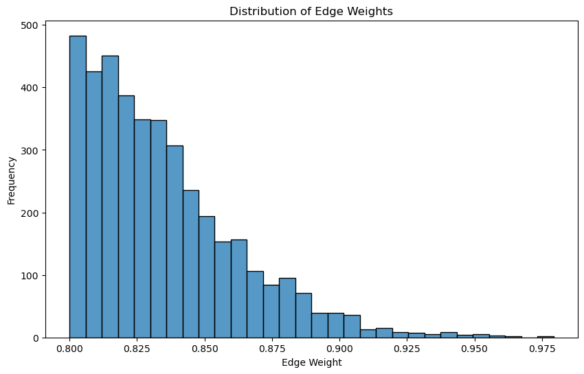
def visualise_edge_weight_distribution(G):
    """
    Visualizes the distribution of edge weights.

    Parameters:
    edge_weights (list): List of edge weights.
    """
    plt.figure(figsize=(10, 6))
    edge_weights = [G[u][v]['weight'] for u, v in G.edges()]
    # Histogram
    sns.histplot(edge_weights, bins=30, kde=False)

    plt.title('Distribution of Edge Weights')
    plt.xlabel('Edge Weight')
    plt.ylabel('Frequency')
    plt.show()
# Visualize the distribution of edge weights
visualise_edge_weight_distribution(pearson_graph_pruned)
7. Sparsification methods#
With sparsification we aim to reduce the number of edges in a network while preserving important structural properties.
Edge Sampling: Randomly removes a fraction of edges.
Thresholding: Removes edges with weights below a certain threshold.
Degree-based Sparsification
def threshold_sparsification(graph, threshold):
    """
    Sparsifies the graph by removing edges below the specified weight threshold.

    Parameters:
    graph (nx.Graph): The original NetworkX graph.
    threshold (float): The weight threshold.

    Returns:
    nx.Graph: The sparsified graph.
    """
    graph_copy = graph.copy()
    sparsified_graph = nx.Graph()
    sparsified_graph.add_nodes_from(graph_copy.nodes(data=True))
    sparsified_graph.add_edges_from((u, v, d) for u, v, d in graph_copy.edges(data=True) if d.get('weight', 0) >= threshold)
    return sparsified_graph

def top_percentage_sparsification(graph, top_percentage):
    """
    Sparsifies the graph by keeping the top percentage of edges by weight.

    Parameters:
    graph (nx.Graph): The original NetworkX graph.
    top_percentage (float): The percentage of top-weight edges to keep.

    Returns:
    nx.Graph: The sparsified graph.
    """
    graph_copy = graph.copy()
    sorted_edges = sorted(graph_copy.edges(data=True), key=lambda x: x[2].get('weight', 0), reverse=True)
    top_edges_count = max(1, int(len(sorted_edges) * (top_percentage / 100)))
    sparsified_graph = nx.Graph()
    sparsified_graph.add_nodes_from(graph_copy.nodes(data=True))
    sparsified_graph.add_edges_from(sorted_edges[:top_edges_count])
    return sparsified_graph


def remove_by_degree(graph, min_degree):
    """
    Sparsifies the graph by removing nodes with degree below the specified threshold.

    Parameters:
    graph (nx.Graph): The original NetworkX graph.
    min_degree (int): The minimum degree threshold.

    Returns:
    nx.Graph: The sparsified graph.
    """
    graph_copy = graph.copy()
    nodes_to_remove = [node for node, degree in dict(graph_copy.degree()).items() if degree < min_degree]

    graph_copy.remove_nodes_from(nodes_to_remove)
    return graph_copy

def knn_sparsification(graph, k):
    """
    Sparsifies the graph by keeping only the top-k edges with the highest weights for each node.

    Parameters:
    graph (nx.Graph): The original NetworkX graph.
    k (int): The number of nearest neighbors to keep for each node.

    Returns:
    nx.Graph: The sparsified graph.
    """
    graph_copy = graph.copy()
    sparsified_graph = nx.Graph()
    sparsified_graph.add_nodes_from(graph_copy.nodes(data=True))

    for node in graph_copy.nodes():
        edges = sorted(graph_copy.edges(node, data=True), key=lambda x: x[2].get('weight', 0), reverse=True)
        sparsified_graph.add_edges_from(edges[:k])

    return sparsified_graph


def spanning_tree_sparsification(graph):
    """
    Sparsifies the graph by creating a minimum spanning tree.

    Parameters:
    graph (nx.Graph): The original NetworkX graph.

    Returns:
    nx.Graph: The sparsified graph.
    """
    graph_copy = graph.copy()
    return nx.minimum_spanning_tree(graph_copy, weight='weight')
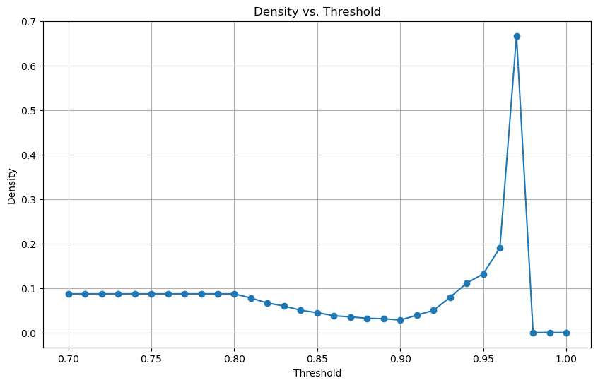
def analyse_and_plot_density(graph):
    """
    Calculates and plots the density of the graph for a predefined series of thresholds.

    Parameters:
    graph (nx.Graph): The original NetworkX graph.

    Returns:
    densities (list of float): Densities of the graph at each threshold.
    """
    thresholds = [0.7 + i * 0.01 for i in range(31)]
    densities = []

    for threshold in thresholds:
        filtered_edges = [(u, v) for u, v, d in graph.edges(data=True) if d['weight'] > threshold]
        temp_graph = nx.Graph()
        temp_graph.add_edges_from(filtered_edges)
        densities.append(nx.density(temp_graph))

    # Plot the densities
    plt.figure(figsize=(10, 6))
    plt.plot(thresholds, densities, marker='o')
    plt.xlabel('Threshold')
    plt.ylabel('Density')
    plt.title('Density vs. Threshold')
    plt.grid(True)
    plt.show()

    return densities
densities = analyse_and_plot_density(pearson_graph_pruned)
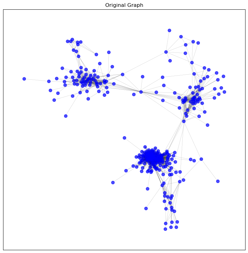
# Initialise a dictionary to store graphs
graphs = {}
# Store the original graph for comparison
graphs['original'] = pearson_graph_pruned.copy()
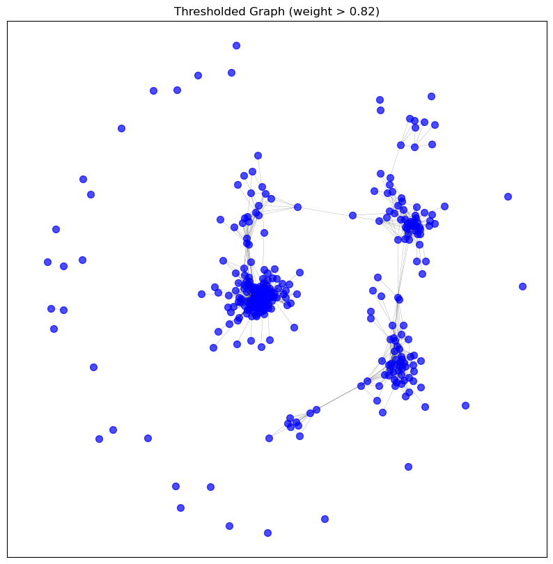
# Apply sparsification methods to the original graph
graphs['threshold'] = threshold_sparsification(graphs['original'], threshold=0.82)
graphs['top_10_percent'] = top_percentage_sparsification(graphs['original'], top_percentage=10)
graphs['degree_below_3'] = remove_by_degree(graphs['original'], min_degree=3)
graphs['knn_5'] = knn_sparsification(graphs['original'], k=5)
graphs['spanning_tree'] = spanning_tree_sparsification(graphs['original'])
# Visualise the graphs after sparsification
visualise_graph(graphs['original'], 'Original Graph')
visualise_graph(graphs['threshold'], 'Thresholded Graph (weight > 0.82)')
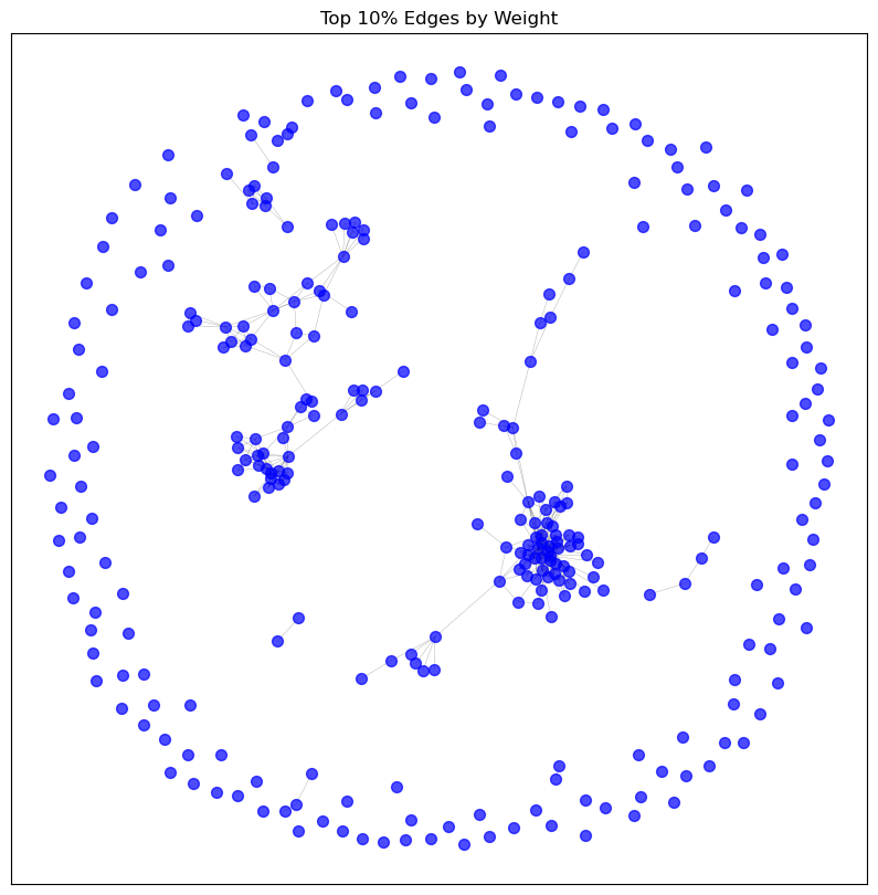
visualise_graph(graphs['top_10_percent'], 'Top 10% Edges by Weight')
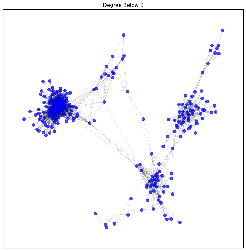
visualise_graph(graphs['degree_below_3'], 'Degree Below 3')
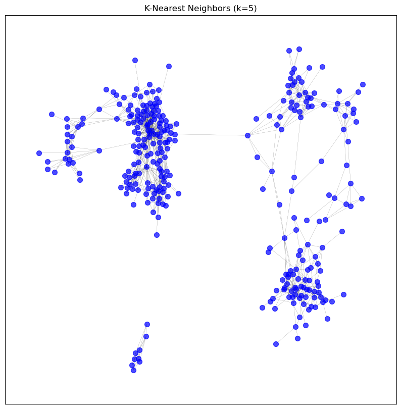
visualise_graph(graphs['knn_5'], 'K-Nearest Neighbors (k=5)')
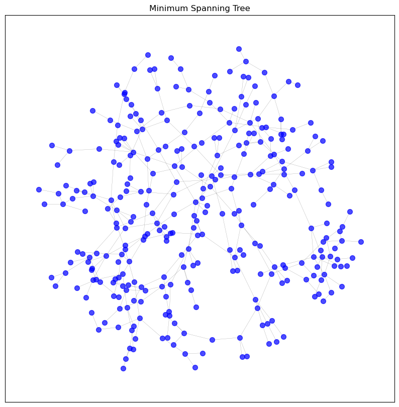
visualise_graph(graphs['spanning_tree'], 'Minimum Spanning Tree')
# Let's inspect the information of the KNN sparsified graph
print_graph_info(graphs['knn_5'])
Number of nodes: 305
Number of edges: 1078
Sample nodes: ['CD3D', 'IGKV1OR2-6', 'IGHV4-59', 'TMEM150B', 'IGKV1-33', 'MZB1', 'IGHV4-61', 'HLA-DPA1', 'IGHV1OR21-1', 'IGLV2-8']
Sample edges: [('CD3D', 'TRBC2', {'weight': 0.9117371975869358}), ('CD3D', 'CD2', {'weight': 0.9059448466134844}), ('CD3D', 'TRAC', {'weight': 0.9003608198550485}), ('CD3D', 'CD3E', {'weight': 0.8880463274216657}), ('CD3D', 'TRBC1', {'weight': 0.8869370962448264}), ('CD3D', 'SIT1', {'weight': 0.8801909350217322}), ('IGKV1OR2-6', 'IGKV1OR2-108', {'weight': 0.8675030870981676}), ('IGKV1OR2-6', 'IGKJ1', {'weight': 0.864609169204325}), ('IGKV1OR2-6', 'IGKV1D-39', {'weight': 0.8627088861614383}), ('IGKV1OR2-6', 'IGKV1ORY-1', {'weight': 0.8562204667144959})]
Graph type: undirected
No self-loops in the graph.
Graph density: 0.023252804141501295
Number of connected components: 2
Average clustering coefficient: 0.5245715856842815
def analyse_knn_effect(graph, k_values):
"""
Analyses the effect of different k values on the network properties.
Parameters:
graph (nx.Graph): The original NetworkX graph.
k_values (list): List of k values to use for sparsification.
Returns:
pd.DataFrame: DataFrame containing the analysis results.
"""
results = {
'k': [],
'num_edges': [],
'avg_degree': [],
'avg_clustering': [],
'num_connected_components': [],
}
for k in k_values:
sparsified_graph = knn_sparsification(graph, k)
num_edges = sparsified_graph.number_of_edges()
avg_degree = sum(dict(sparsified_graph.degree()).values()) / sparsified_graph.number_of_nodes()
avg_clustering = nx.average_clustering(sparsified_graph)
num_connected_components = nx.number_connected_components(sparsified_graph)
results['k'].append(k)
results['num_edges'].append(num_edges)
results['avg_degree'].append(avg_degree)
results['avg_clustering'].append(avg_clustering)
results['num_connected_components'].append(num_connected_components)
return pd.DataFrame(results)
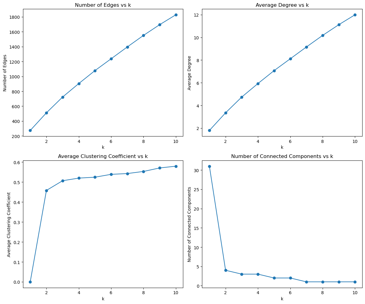
def plot_knn_analysis(df):
"""
Plots the analysis of the effect of different k values on network properties.
Parameters:
df (pd.DataFrame): DataFrame containing the analysis results.
"""
fig, axes = plt.subplots(2, 2, figsize=(12, 10))
axes[0, 0].plot(df['k'], df['num_edges'], marker='o')
axes[0, 0].set_title('Number of Edges vs k')
axes[0, 0].set_xlabel('k')
axes[0, 0].set_ylabel('Number of Edges')
axes[0, 1].plot(df['k'], df['avg_degree'], marker='o')
axes[0, 1].set_title('Average Degree vs k')
axes[0, 1].set_xlabel('k')
axes[0, 1].set_ylabel('Average Degree')
axes[1, 0].plot(df['k'], df['avg_clustering'], marker='o')
axes[1, 0].set_title('Average Clustering Coefficient vs k')
axes[1, 0].set_xlabel('k')
axes[1, 0].set_ylabel('Average Clustering Coefficient')
axes[1, 1].plot(df['k'], df['num_connected_components'], marker='o')
axes[1, 1].set_title('Number of Connected Components vs k')
axes[1, 1].set_xlabel('k')
axes[1, 1].set_ylabel('Number of Connected Components')
plt.tight_layout()
plt.show()
k_values = list(range(1, 11))  # Different k values to analyze
analysis_results = analyse_knn_effect(graphs['original'], k_values)

# Plot the analysis results
plot_knn_analysis(analysis_results)
8. Describing Highly Connected Nodes#
def get_highest_degree_nodes(graph, top_n=10):
    """
    Returns the nodes with the highest degree in the graph.

    Parameters:
    graph (nx.Graph): The NetworkX graph.
    top_n (int): The number of top nodes to return.

    Returns:
    List of tuples: Each tuple contains a node and its degree.
    """
    degrees = dict(graph.degree())
    sorted_degrees = sorted(degrees.items(), key=lambda x: x[1], reverse=True)
    return sorted_degrees[:top_n]

def fetch_gene_info(gene_list):
    """
    Fetches gene information from MyGene.info.

    Parameters:
    gene_list (list): List of gene symbols or Ensembl IDs.

    Returns:
    list: List of dictionaries containing gene information.
    """
    mg = mygene.MyGeneInfo()
    gene_info = mg.querymany(gene_list, scopes='symbol,ensembl.gene',
                             fields='name,symbol,entrezgene,summary,disease,pathway',
                             species='human')
    return gene_info

def print_gene_info_with_degree(top_genes_with_degrees, gene_info):
    """
    Prints gene information including the degree.

    Parameters:
    top_genes_with_degrees (list): List of tuples containing gene symbols and their degrees.
    gene_info (list): List of dictionaries containing gene information.
    """
    for gene, degree in top_genes_with_degrees:
        info = next((item for item in gene_info if item['query'] == gene), None)
        if info:
            print(f"Gene Symbol: {info.get('symbol', 'N/A')}")
            print(f"Degree: {degree}")
            print(f"Gene Name: {info.get('name', 'N/A')}")
            print(f"Entrez ID: {info.get('entrezgene', 'N/A')}")
            print(f"Summary: {info.get('summary', 'N/A')}")
            if 'disease' in info:
                diseases = ', '.join([d['term'] for d in info['disease']])
                print(f"Diseases: {diseases}")
            else:
                print("Diseases: N/A")
            if 'pathway' in info:
                pathways = []
                if isinstance(info['pathway'], dict):
                    for key in info['pathway']:
                        pathway_data = info['pathway'][key]
                        if isinstance(pathway_data, list):
                            pathways.extend([p['name'] for p in pathway_data if 'name' in p])
                        elif isinstance(pathway_data, dict) and 'name' in pathway_data:
                            pathways.append(pathway_data['name'])
                        elif isinstance(pathway_data, str):
                            pathways.append(pathway_data)
                print(f"Pathways: {', '.join(pathways) if pathways else 'N/A'}")
            else:
                print("Pathways: N/A")
            print("-" * 40)
        else:
            print(f"Gene not found: {gene}")
            print(f"Degree: {degree}")
            print("-" * 40)
# get the top 10 genes with the highest degree in the pruned graph using get_highest_degree_nodes
top_genes_with_degrees = get_highest_degree_nodes(pearson_graph_pruned, top_n=10)
gene_symbols = [gene for gene, degree in top_genes_with_degrees]

# get gene information with fetch_gene_info
gene_info = fetch_gene_info(gene_symbols)

# print gene information including degree
print_gene_info_with_degree(top_genes_with_degrees, gene_info)
4 input query terms found dup hits: [('IGHJ4', 2), ('IGKV3-20', 2), ('IGKV3-11', 2), ('IGKV1-39', 2)]
Gene Symbol: IGKJ1
Degree: 118
Gene Name: immunoglobulin kappa joining 1
Entrez ID: 28950
Summary: Predicted to be involved in adaptive immune response. Predicted to be located in extracellular region and plasma membrane. Predicted to be part of immunoglobulin complex. [provided by Alliance of Genome Resources, Apr 2022]
Diseases: N/A
Pathways: N/A
----------------------------------------
Gene Symbol: MZB1
Degree: 109
Gene Name: marginal zone B and B1 cell specific protein
Entrez ID: 51237
Summary: Involved in positive regulation of cell population proliferation. Located in cytoplasm and extracellular region. [provided by Alliance of Genome Resources, Apr 2022]
Diseases: N/A
Pathways: N/A
----------------------------------------
Gene Symbol: FCRL5
Degree: 108
Gene Name: Fc receptor like 5
Entrez ID: 83416
Summary: This gene encodes a member of the immunoglobulin receptor superfamily and the Fc-receptor like family. This gene and several other Fc receptor-like gene members are clustered on the long arm of chromosome 1. The encoded protein is a single-pass type I membrane protein and contains 8 immunoglobulin-like C2-type domains. This gene is implicated in B cell development and lymphomagenesis. Alternatively spliced transcript variants encoding different isoforms have been identified. [provided by RefSeq, Sep 2010].
Diseases: N/A
Pathways: N/A
----------------------------------------
Gene Symbol: IGKC
Degree: 106
Gene Name: immunoglobulin kappa constant
Entrez ID: 3514
Summary: Predicted to enable antigen binding activity and immunoglobulin receptor binding activity. Involved in retina homeostasis. Located in blood microparticle and extracellular exosome. [provided by Alliance of Genome Resources, Apr 2022]
Diseases: N/A
Pathways: N/A
----------------------------------------
Gene Symbol: IGHJ4
Degree: 105
Gene Name: immunoglobulin heavy joining 4
Entrez ID: 28477
Summary: N/A
Diseases: N/A
Pathways: N/A
----------------------------------------
Gene Symbol: IGLL5
Degree: 99
Gene Name: immunoglobulin lambda like polypeptide 5
Entrez ID: 100423062
Summary: This gene encodes one of the immunoglobulin lambda-like polypeptides. It is located within the immunoglobulin lambda locus but it does not require somatic rearrangement for expression. The first exon of this gene is unrelated to immunoglobulin variable genes; the second and third exons are the immunoglobulin lambda joining 1 and the immunoglobulin lambda constant 1 gene segments. Alternative splicing results in multiple transcript variants. [provided by RefSeq, May 2010].
Diseases: N/A
Pathways: N/A
----------------------------------------
Gene Symbol: IGKV3-20
Degree: 97
Gene Name: immunoglobulin kappa variable 3-20
Entrez ID: 28912
Summary: Involved in antibacterial humoral response and glomerular filtration. Located in extracellular space. Part of monomeric IgA immunoglobulin complex; pentameric IgM immunoglobulin complex; and secretory IgA immunoglobulin complex. [provided by Alliance of Genome Resources, Apr 2022]
Diseases: N/A
Pathways: N/A
----------------------------------------
Gene Symbol: IGKV3-11
Degree: 96
Gene Name: immunoglobulin kappa variable 3-11
Entrez ID: 28914
Summary: Predicted to be involved in immune response. Located in blood microparticle and extracellular exosome. [provided by Alliance of Genome Resources, Apr 2022]
Diseases: N/A
Pathways: N/A
----------------------------------------
Gene Symbol: IGKV3D-11
Degree: 95
Gene Name: immunoglobulin kappa variable 3D-11
Entrez ID: 28876
Summary: Predicted to be involved in immune response. Located in blood microparticle and extracellular exosome. [provided by Alliance of Genome Resources, Apr 2022]
Diseases: N/A
Pathways: N/A
----------------------------------------
Gene Symbol: IGKV1-39
Degree: 95
Gene Name: immunoglobulin kappa variable 1-39
Entrez ID: 28930
Summary: Predicted to be involved in immune response. Located in blood microparticle and extracellular exosome. [provided by Alliance of Genome Resources, Apr 2022]
Diseases: N/A
Pathways: N/A
----------------------------------------
9. Storing Generated Networks#
# Save the pruned graph as a GML file
#nx.write_gml(pearson_graph_pruned,
#             os.path.join(intermediate_data_dir,'gene_coexpression_network_workshop.gml'))
[Extra] Interactive Visualization#
def save_interactive_network_plotly(graph, output_file='network.html', title="Interactive Network"):
    # Extract node positions
    pos = nx.spring_layout(graph)

    # Extract edges
    edge_x = []
    edge_y = []
    for edge in graph.edges():
        x0, y0 = pos[edge[0]]
        x1, y1 = pos[edge[1]]
        edge_x.append(x0)
        edge_x.append(x1)
        edge_x.append(None)
        edge_y.append(y0)
        edge_y.append(y1)
        edge_y.append(None)

    edge_trace = go.Scatter(
        x=edge_x, y=edge_y,
        line=dict(width=0.5, color='#888'),
        hoverinfo='none',
        mode='lines')

    # Extract nodes
    node_x = []
    node_y = []
    node_text = []
    for node in graph.nodes():
        x, y = pos[node]
        node_x.append(x)
        node_y.append(y)
        node_text.append(str(node))

    node_trace = go.Scatter(
        x=node_x, y=node_y,
        mode='markers+text',
        text=node_text,
        hoverinfo='text',
        marker=dict(
            showscale=True,
            colorscale='YlGnBu',
            size=10,
            colorbar=dict(
                thickness=15,
                title='Node Connections',
                xanchor='left',
                titleside='right'
            ),
        )
    )

    fig = go.Figure(data=[edge_trace, node_trace],
                    layout=go.Layout(
                        title=title,
                        titlefont_size=16,
                        showlegend=False,
                        hovermode='closest',
                        margin=dict(b=20,l=5,r=5,t=40),
                        annotations=[ dict(
                            text="",
                            showarrow=False,
                            xref="paper", yref="paper"
                        )],
                        xaxis=dict(showgrid=False, zeroline=False),
                        yaxis=dict(showgrid=False, zeroline=False))
                    )

    # Save the figure to an HTML file
    pio.write_html(fig, file=output_file, auto_open=True)
# save_interactive_network_plotly(pearson_graph_pruned,
#                                 output_file=os.path.join(intermediate_data_dir,'genecoexp_plotly_workshop.html'),
#                                   title="Gene Coexpression Network")